Adding Air Quality Monitoring to Home Assistant
The air quality along the US and Canadian east coast was pretty rough last week. It seemed like the kind of thing that would be good to monitor on a home assistant dashboard - turns out it’s pretty easy. Here’s how I did it.
AirNow
The US EPA provides a free fire and smoke map which sources data from a variety of air quality sensors across the country.
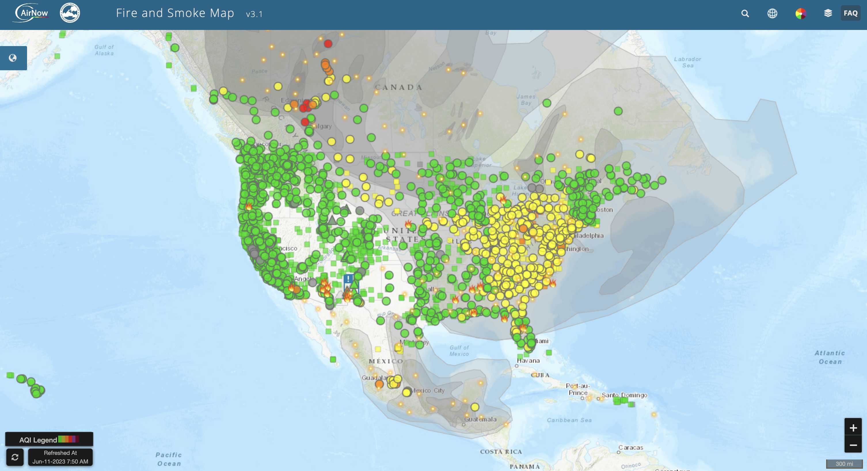
They also provide an API, and home assistant has an integration for it. You’ll need to register for an AirNow API key (free), and plug your lat/long into the integration. That’s it - easy.
Dashboard Widget
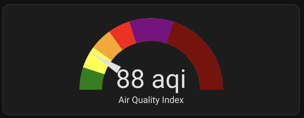
I added this gauge widget that uses the AQI sensor to visually show the air quality.

I added ranges to match the legend used by AirNow. The visual editor gives you options to define standard green/yellow/red severity, but you can add custom steps by adding the segments key to the yaml like this:
type: gauge
entity: sensor.airnow_aqi
min: 0
max: 500
segments:
  - from: 0
    color: '#008000'
  - from: 51
    color: '#ffff00'
  - from: 101
    color: '#ffa500'
  - from: 151
    color: '#ff0000'
  - from: 201
    color: '#800080'
  - from: 301
    color: '#800000'
name: Air Quality Index
needle: true